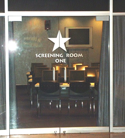
Screening Room One
The second survey I'm writing about was also in the MGM Grand. In this case there were recruiters in the shopping area of the Hotel. The proposition was straightforward - watch a TV show in the screening room and complete a survey at the end. "It's free entertainment, takes less than an hour and you'll get some free vouchers at the end". The recruitment is professional, with uniformed representatives and a very stylish screening room visible nearby.
I report back at the start of the next hour and after a short wait take a seat in front of one of the terminals. There's a lady there to explain the process. She mock chastises a couple at the front says she may have to separate them if they keep talking. It's good natured and she explains that she used to be a school teacher.
First we've got to complete a registration form on the console - there's a touch screen here and a keyboard, but they've made a major mistake here by not providing a mouse. The form is a simple HTML form and it meets all the W3C guidelines on accessibility, but it's not very accessible because there's no mouse. The elements have to be highlighted using the touch screen, but it's difficult to hit a small radio button or text field with my big fat cartoon-sized fingers. Of course I know how to TAB and Shift-TAB my way around - but this audience isn't full of geeks who know those kind of things - they'd be much more comfortable with a mouse.
I can see the thinking that has gone into this - it's kind of a melange of 'Touch Screen for Accessibility' and 'W3C guidelines for accessiblity' combined to make something that's just not accessible. They either should be using a touch screen with great big bright buttons in a Flash survey - or use an HTML based survey with a keyboard and mouse.
Next we're all given audience feedback devices, these have a dial that can go from 0 to 100 and we're asked to change that dial during the showing accoriding to how much we like or dislike what we're seeing. It's not explained well exactly how these should be used - I'm not sure to turn it up for the jokes that I like and then turn it back down again or to leave it, or only turn it down when I see something I don't like. I do my best with it and try to respond to what I'm seeing. I notice on the back of these devices that they're provided by a UK company - IML Ltd. (Aside - there is an episode of the West Wing where they are used extensively to judge a State of Union address).
After the showing, it's back to the console to complete a survey - again this is with the HTML mouse-less interface. It's a let down in an otherwise very well organized event. The girl on my left accidentally exits the survey early - I think she was having difficultly moving the scrollbar with the touch screen. I struggle through - there are pages and pages of radio buttons at the end of the survey asking me to rate all the TV shows I've heard of. Usually this is the point in surveys where I click the next button to get to the end, but the invigilation/school-room effect kicks in and I dutifully complete all the answers accurately.
At the end we're all given some vouchers - those are pretty disappointing - 2 for one hotdogs and pretzels - that sort of thing.
I guess the conclusion here is that you've got to see the actual user experience rather than just blindly follow guidelines of how things should be. Also the invigilation/school-room effect is useful for keeping survey participants focused.
Posted by Alexander at September 12, 2005 11:17 AM
Make Flash tests and assessments with the Question Writer, Quiz Software. Question Writer 4 is now available. Click here to download.